|
For my self portrait piece I attempted to draw myself and shade with charcoal. In it, I tried to use elements of shading and not letting on place be completely white. The shading was used to make a place look lighter than the other and try to make the artwork seem more 3D and realistic. I used an eraser to make some areas seem more shiny or lighter and darkened places with charcoal to make the shadows / body part really stick out. The thing I think really sticks out in this piece are the small lips and the details in the hair. Both have lots of elements that make them stick out a lot more and appear more satisfying and real. Although I don't like how the face looks and the over all proportions of the picture, I really do think it halped improve my shading skills and overall knowledge about realistic paintings in B/W.
0 Comments
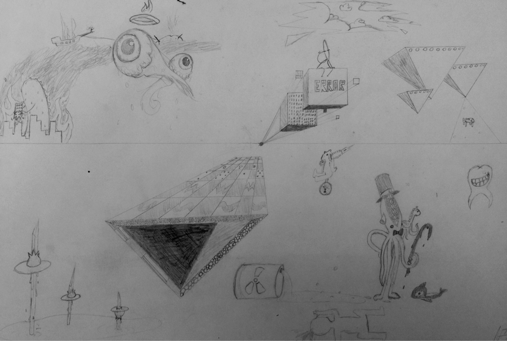
In this art piece, I tried to create a surreal environment involving odd objects, weird creatures, and impossible factors. I used prospective, occasional shading, and a vanishing point to help me complete these tasks to make the work seem more advanced and detailed in work. Usually coming up with weird ideas is a piece of cake for me, however, since I was asked to, it was a lot harder for some reason. I created this to symbolize things that I am interested in represented in odd format. I added some things in the piece that correspond a lot with me (probably unknown to the viewer).
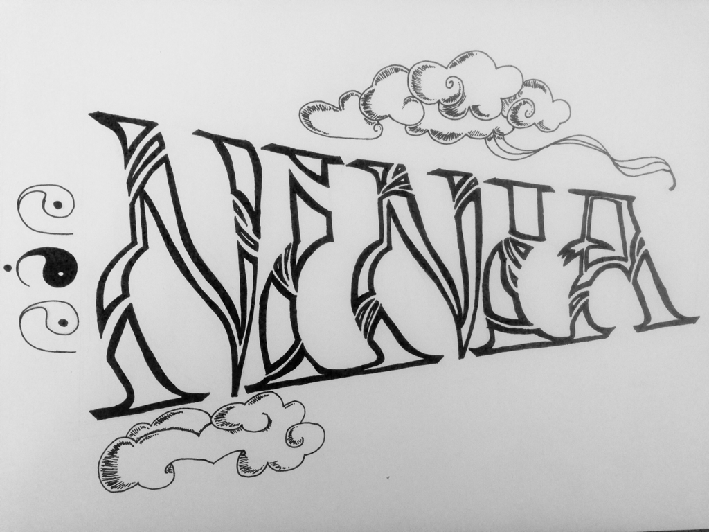
My second art work for beginners art is of a typography drawing that reads 'Ninia", on the top right above the name is a cloud modeled after old Chinese art (there is also a cloud on the bottom left of the name), and on the left of the name written side ways are three yin yang pieces the read 'Nin' which is the nickname of 'Ninia'. I used (to my satisfaction) a lot of black ink to out line the name 'Ninia' to make it appear bolder and also used some cross hatching to shade plus add volume to the Chinese styled clouds. The focal point in my project was the name 'Ninia' which I managed by a very thick black outline and intricate lines cutting through the letters. Summed up, I created this typography piece to design a poster for my wall to represent one of my fictional characters that I've created. Her name is Ninia Mech but Nin for short.
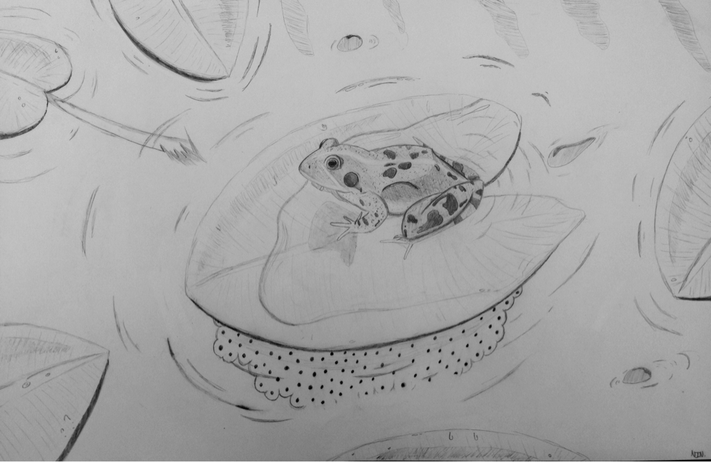
For this art project, I decided to depict a frog on a lily pad, protecting the eggs that lie on the underside of the water leaf. The things I learned from this project was a lot about shading, providing volume to the piece, and drawing realistic items because I usually cartoon, which... Wasn't very helpful for this project. My technique involved quite a bit of sketchy lines and odd shading with a very strict pencil. Charcoal would have made it a lot easier to shade this piece. I'm very proud of the center piece; the frog. I had used shading that I had learned about, and gave it as much volume as my artistic abilities and learning could provide. Finally, the reason I chose a frog in it's natural habitat guarding it's eggs was so I could give it to my mother afterwards. (Yes i'm cheesy, let me live my life.) I wanted to give her an artsy present that pictured her and how she felt about children.
[Fin.] |
 RSS Feed
